You're not you when you're a commodity.

Last week, we took a look at well-know advertisers and some of their campaigns, as well what makes great advertising.

In this second instalment, we take a look at how creativity is here to save the day, how empathy can help us gain a deeper understanding of our audiences and ourselves as well as the value of risk-taking in a safety-obsessed world.


Creativity is only way to stand out

There are many examples of ads out there that were able to stand out and be remembered many years after they were released. If not all of them, the huge majority are remembered because they were conceived in contrast with other, more conventional ads. It’s that contrast with the conventions that made them stand out.

Creativity can take many forms, but humor is the widely considered to be the fastest way to break the mold and send a message that company X isn’t like companies A,B,C and D. It takes courage because as humans, we generally do not like to stand out and want to blend in, to relate. A company with the confidence to stand out, is a company that knows itself well enough to know what makes them unique and not be afraid to communicate that message in their adverts.


Understanding of one’s audience is the only way to truly connect.

The risks taken in setting oneself on the path to stand out from one’s competitors can be mitigated by researching one's audience and gaining a deeper understanding of who they are. You need to learn about them, their fears and their aspirations. By doing so, you will gain two things: first, a direct path to forming an emotional connection with them and second, the ability to cut through the noise and send a message that they will instantly relate to.


Understanding oneself

Similarly, companies have to spend time understanding themselves and do their homework reflecting on what makes them unique, as well as combine that knowledge with that gained of studying their audience. Finding a purpose is a great place to start. A lot of companies out there have a default purpose that is uninspiring. It is necessary to dig down to what the aspirations of the business are. Every great company has clear and concise purpose and is very clear on what that is.

Armed with the tools of empathetic understanding of itself as well as its audience, any business can set itself on the path to stand out.


But I'm afraid of taking risks!

Setting oneself apart is taking a risk, no question about this. There are many examples out there of companies that alienated their audience because their messaging veered too far from what people were accustomed to. However, armed with the right tools, solid knowledge about itself and its audience, a business should be able to find a way to both stand out and not alienate the people it caters to.

Ultimately, it comes down to this choice: either one is willing to take risks and the potential reward is great, or one decides to stick with the status quo with the high probability of commoditization and increased competition, making it harder to run a successful business. Do you want to be Old Spice or Charmin?

It is also important to remember, and O'Reilly explains that in detail in his book, that the large majority of companies who have taken a leap of faith and changed their messaging for the better have seen tremendous returns. Case in point: Snickers with their ongoing "You're not you when you're hungry" campaign has seen their global sales in the first year of running the campaign increase by 15.9%

What are examples of businesses you’ve seen taking similar risks and get results? Comment below to share your thoughts!

Old Spice or Charmin?

This I Know, is a book the advertising by industry veteran Terry O’Reilly. O’Reilly not only is one of the best storytellers out there, but his hilarious take on the advertising industry reveals a lot of secrets about great advertising, and what makes it successful.

In this first installment of our 3-part article, we will take a look at what makes an ad memorable and why Charmin has nothing on Old Spice when it comes to creativity.


What makes a memorable ad?

Think about a memorable ad that you’ve seen - any one of them will do - and now try to remember why it stands out in your memory, even years later. Chances are it was unlike any other ads of the time and perhaps even since.

The most memorable of these are funny, irreverent, sometimes downright outrageous (warning: NSFW - sound off), highly creative and often do not focus on the product or service offered, but rather how the offering makes the audience feel.


Old Spice does it right.

These ads usually fit two criteria: they are creative, often by employing humour and they manage to create a strong connection to the audience. The creativity enables the ad to stand out. By presenting the subject in an unexpected way, it commands the audience attention.

Take any of the Old Spice ads with Terry Crews, they are funny, nonsensical and talk less about the product than its supposed benefits for the user. Seeing Crews being a goofball is a treat in itself, but hearing in the subtext that Old Spice will somehow make me smell and look like him, makes me want to buy Old Spice, even though I would never in a million years buy a scented shower gel. It does so by connecting with the deepest desires and fears of their target: men. Indeed, who wouldn't want to smell, look cool and ripped? The creators of the ad went through the trouble of understanding their audience - empathizing with them - and used this knowledge to address their fears and desires.


Charmin does it wrong.

Conversely, take Charmin toilet paper ads for example, are for the most part safe, ultra-boring and speak to their audience like children. There is a reason we never remember any of them. They place the product firmly in the commodity box, where one roll of toilet paper is perceived as the same as any other roll of toilet paper.

As we’ve learned to tune them out after a lifetime of conditioning, they lose their effectiveness. They end up sounding condescending as they are the advertising equivalent of someone robotically repeating the same sentence over and over with no end in sight. I don't know about you, but I personally find pastel-colored bears irritating, insulting even. I am looking forward to the day where we see old-spice like TP adverts.

We’ve just looked at how effective advertising can be. In the next instalment, we will take a look at the power of creativity and risk-taking. Stay tuned!

What are some examples of bad ads that have stood out to you? Comment below to share your thoughts.

Photography + Styling = Killer Images

Styling is the art of making a space look like it’s lived in, often in a subtle and discrete fashion. Ideally it is something that not consciously noticeable because it looks natural. This effortless look requires a lot of planning and production work, but the results are often far beyond what a professional photographer alone can offer.

Kitchen

Kitchen

Révélateur studio always strives to improve the quality of its offerings and client satisfaction. This is why we are pleased to announce a partnership with professional stylist Laurie Clark. Starting immediately we are offering styled photography packages. By offering these packages, we take the headache out of shooting professionally styled quality photography, while delivering incredible value as these images will make you look fresh and professional.

Main entrance and lounge

Main entrance and lounge

Laurie Clark of GH Styleworks is a master stylist with a background in art direction and graphic design. She has an eye for the killer accent that is going to bring a photograph together. Our own architectural and photography background complements Laurie’s skill set perfectly and we can together deliver images of exceptional quality.

Dressing room

Since a picture is worth a thousand words, the images included in here a few example of images that came out of a shoot we did with Laurie (Project: Taylorwood, Build: Rose Barroso | Barroso Homes, Design: Urbanscape | Ali Malek-Zadeh). Feel free to contact us for further information on these packages.

Main entrance

Tips for hiring an architectural photographer #10

This is post 10 of 10, in a series detailing important aspects to hiring an architectural photographer while avoiding the most common pitfalls.

10. DO IT RIGHT THE FIRST TIME. 

Some shoots will require specific equipment and skills to be done properly. Do not skimp out on the expense if it gives you the images you need. Equipment rental and consultants are sometimes necessary to get the job done well. You photographer will be able to make appropriate recommendations.

Webster PS, Kohn Shnier Architects, Toronto

Tips for hiring an architectural photographer #8

This is post 8 of a series of 10, in a series detailing important aspects to hiring an architectural photographer while avoiding the most common pitfalls.

8. CONSIDER ENVIRONMENTAL FACTORS.

Your photographer should know how to deal with these factors (seasons, weather and time of day) in order to take the best shots at the ideal time. Factor in weather and allow for contingency plans. Architectural photography is particularly subject to weather, especially when shooting exteriors. When planning a shoot, ask if your photographer has a contingency plan in the case of bad weather - and do not hesitate to reschedule. If images are shot in poor weather, you risk having to re-shoot the project at additional expense if the quality is negatively affected. Ask your photographer to supply you with a site prep checklist. There is a lot more going into preparing the site for photography than just cleaning up. In order to get the best looking shots, ask your photographer to make recommendations for staging the images. 

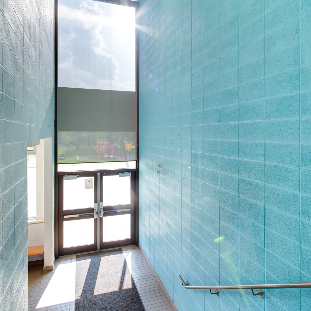
Warden Avenue Jr. PS, Kohn Shnier Architects, Toronto

Tips for hiring an architectural photographer #7

This is post 7 of a series of 10, in a series detailing important aspects to hiring an architectural photographer while avoiding the most common pitfalls.

7. GIVE CREDIT WHERE IT’S DUE.

Mutually beneficial relationships are best for all parties involved and crediting your photographer whenever you use their images is more than a mere contractual requirement, it is an ethical thing to do. They should also credit you, the client, on their online and offline marketing material. Do not hesitate to ask them to do so should they not offer it from the get-go (it can also be a contractual agreement). 

Webster PS, Kohn Shnier Architects, Toronto

Webster PS, Kohn Shnier Architects, Toronto

Tips for hiring an architectural photographer #6

This is post 6 of a series of 10, in a series detailing important aspects to hiring an architectural photographer while avoiding the most common pitfalls.

6. MINIMIZE YOUR COSTS.

A good photographer will understand your needs and help you come up with a solution that fits your budget. There are many ways to keep costs reasonable and this should be discussed with your photographer, for example:

1. Shop locally if you can. By avoiding travel expenses, you save money and promote the local economy.

2. Bundle shoots together. If you can combine several projects to be shot at the same time, your photographer should be able to give you a better deal.

3. Use fewer and better views. Carefully consider the shots you need in order to save money. If unsure, your photographer will have a good idea of what shots will best tell the story of your project. Ask them to make recommendations.

4. Keep the bottom line in mind. How much money are you likely to make with these images? How many projects can they help you win? 

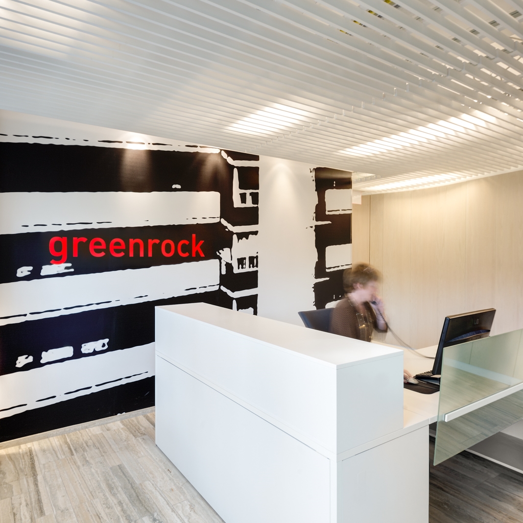
Greenrock rental management office, Toronto, Kohn Shnier Architects

Tips for hiring an architectural photographer #5

This is post 5 of a series of 10, in a series detailing important aspects to hiring an architectural photographer while avoiding the most common pitfalls.

5. GET THE RIGHT LICENSE.

Great savings are within reach if you predetermine how your images are going to be used, including potential uses that might not appear necessary at first. Discuss your licensing options with your photographer and favor open source licenses (such as Creative Commons) over copyrighted images as these will give you more flexibility in the way the images can be used and limit your legal liability in case of a dispute. It is important to understand copyright law and how you can use your images - not all licenses are created equal - and be sure to ask your photographer to walk you through the type of license he/she is going to use and how it will impact your rights to the images. These licensing terms should be clearly detailed in the photographer’s contract. 

Tips for hiring an architectural photographer #4

This is post 4 of a series of 10, in a series detailing important aspects to hiring an architectural photographer while avoiding the most common pitfalls.

COLLABORATE

Photographing buildings and interiors is not an exact science and it requires collaboration between the photographer and client, in order to achieve the client’s vision. Photographers have a particular way to look at spaces, usually different from the clients'. It is a good idea to use this difference in viewpoints as a sounding board for coming up with ideas that neither you, the client, nor the photographer might have thought of on their own. The pre-production meeting and the scouting shoot are great places to brainstorm and kick-start this process. If you are going to be present on the day of the shoot, use this to you advantage by discussing each view with your photographer and formulating your specific needs in the clearest way possible. Your photographer should be able to show you each shot prior to capturing the image to serve as the basis for discussion. 

Yorkville residence, Audax Architecture

Yorkville residence, Audax Architecture

Tips for hiring an architectural photographer - #3

This is post 3 of a series of 10, in a series detailing important aspects to hiring an architectural photographer while avoiding the most common pitfalls.

UNDERSTAND AND FORMULATE YOUR NEEDS. 

It is advisable to sit down and think about what your needs are prior to discussing them with a photographer, in order to make them clear to the professionals you will be hiring. Think about the aesthetic/mood you are trying to achieve, the number of images you need, the way you envision your project to be shot, your budget and any other specific requirements you may have. Photographers should be able to help you uncover these needs by asking a series of increasingly pointed questions and come up with a tailored estimate that will cover all those needs. Once that discovery process is complete, the photographer will know exactly what those needs are. Remember that “understandings prevent misunderstandings” and ask your photographer to clarify anything that is unclear. Do not let technical terms and jargon confuse you. 

Tips for hiring an architectural photographer #1

This post is the first of a series of ten, detailing the most important aspects to hiring an architectural photographer while avoiding the most common pitfalls.

GO FOR VALUE OVER PRICE. 

When hiring a photographer, it is important to consider what is included in the service that was quoted to you. Not all photographers’ fees are created equal and it is critical to read the fine print in order to understand what the fees include. Some professionals will do a “package price” including a variety of services while others will break down their estimates into line items. When comparing fees, make sure that these include comparable services and more importantly, that those services suit you. Be wary of items that are included but not needed for your purposes.