Little Portugal fixer-upper by Downey Design

This project was featured on our blog a few months back, when we shot the interiors for the Designer. We have recently returned to shoot the exterior of the building upon completion of the landscaping.

Main facade

Home to Arts & Labour home-studio, the renovation turned an old factory into an airy, bright space that appears to be much bigger than it actually is.

Main Entrance

Although the renovated building may appear mundane at first glance, it is the simplicity of the elegant materials and solid detailing that makes it come to life in an understated fashion. It is first and foremost a very livable space as evidenced by the spatial and light qualities one finds throughout the project.

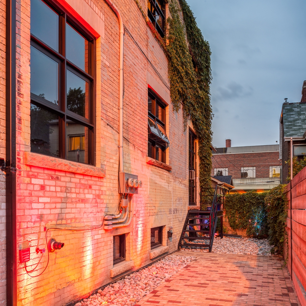
Landscaped courtyard


Tips for hiring an architectural photographer #8

This is post 8 of a series of 10, in a series detailing important aspects to hiring an architectural photographer while avoiding the most common pitfalls.

8. CONSIDER ENVIRONMENTAL FACTORS.

Your photographer should know how to deal with these factors (seasons, weather and time of day) in order to take the best shots at the ideal time. Factor in weather and allow for contingency plans. Architectural photography is particularly subject to weather, especially when shooting exteriors. When planning a shoot, ask if your photographer has a contingency plan in the case of bad weather - and do not hesitate to reschedule. If images are shot in poor weather, you risk having to re-shoot the project at additional expense if the quality is negatively affected. Ask your photographer to supply you with a site prep checklist. There is a lot more going into preparing the site for photography than just cleaning up. In order to get the best looking shots, ask your photographer to make recommendations for staging the images. 

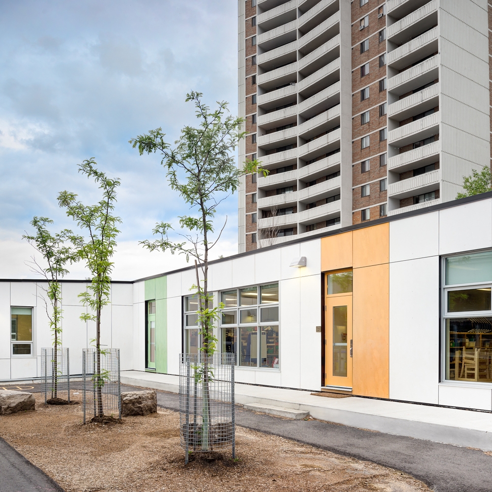
Warden Avenue Jr. PS, Kohn Shnier Architects, Toronto

Junction Bungalow by STAMP Architecture

Revelateur recently had the pleasure to shoot a post-war bungalow renovation in the Junction neighbourhood of Toronto.

Main entrance, front of the house.

Designed by Brad Netkin of Stamp Architecture, the house is an very clever take on the bungalow typology. The original house was gutted and a second story was added, so that the main floor was turned into a spacious living-room / kitchen space opening onto the backyard and the front of the house was turned into a cosy dining room.

Entrance, Dining room, looking towards back of the house.

The main design feature of this house is a rather intangible one: natural light. Indeed, large windows and skylights are common currency in every area of the house, making the entire dwelling a very pleasant, airy one that makes one feel at ease instantly.

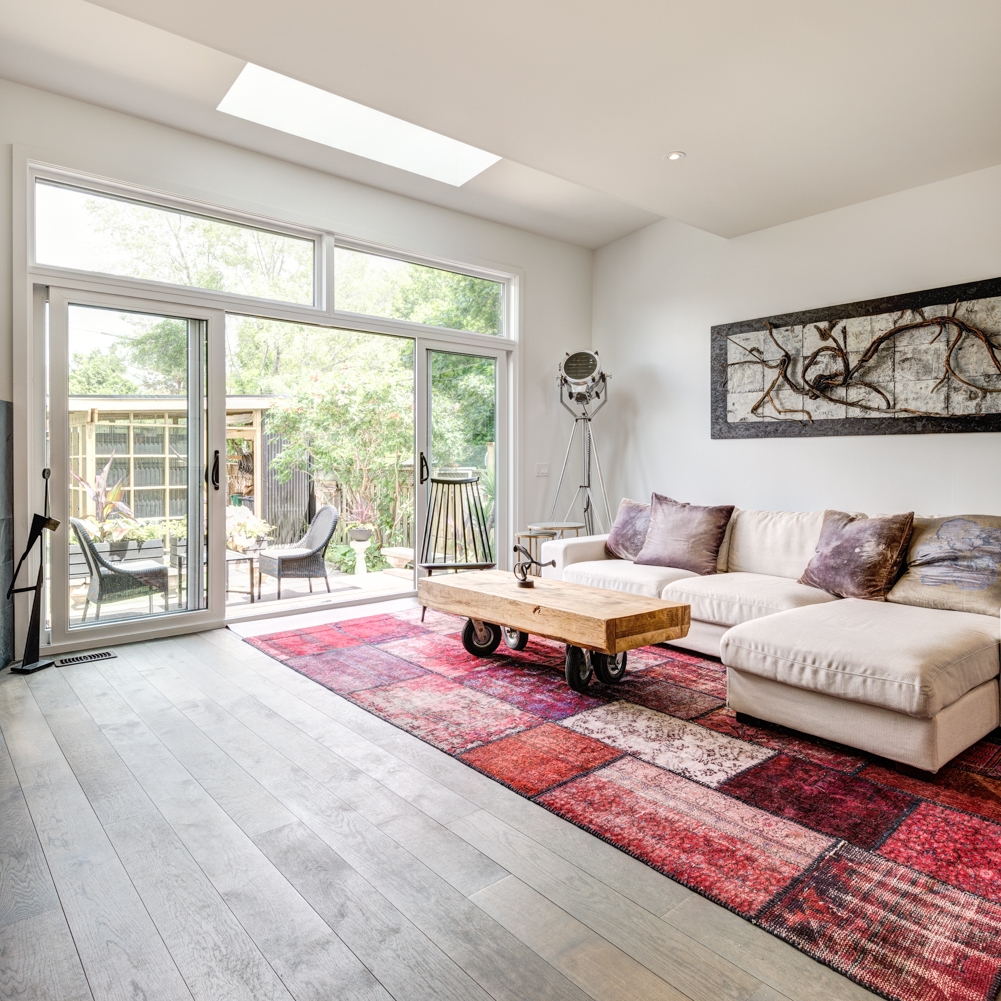
Living room, looking towards entrance.

Add to the the mix the architect's idionsyncratic furniture and art collection and you get a home that is humble in its materials and finishes yet very generous with large spaces that give away a subdued feeling of luxury. This is not a house of ostentatious character, but rather a symphony of natural light.

Staircase with skylight

There is a constant connection to the outdoors in almost every space of this bungalow. That alone makes it worth experiencing in person.

Back of the house, from backyard