The Truth On Architectural Imagery

Reading time ~10 minutes

pexels-photo-712786.jpeg

Introduction:

The latest developments of evolutionary psychology teach us that our sensory perception of reality is not the window into the truth that we’ve assumed it was for a long time. Rather, it’s more like a metaphorical desktop on a computer, where the reality of the computing power if hidden behind symbolic representations of reality (e.g. the file folders on a virtual desktop). That helps us accomplish our tasks without being burdened by the minutiae of the computer’s inner workings, which would never allow me to easily and effortlessly write this piece as I was able to do, if I had to literally try and understand how everything works in a computer, down to micron-sized transistors.

What that means in concrete terms, is that evolutionary psych. tells us that we don’t see the world as it really but rather that we interpret it, these interpretations being a reflection of our evolutionary fitness. I.e., we have evolved interpretations of reality that allowed us to survive and thrive.

By the same token, since there is no such thing as an accurate perception of reality, the same goes for how we create visual media that represent the world around us. I would go as far as saying - in the example of a photograph or video of a space - that the very act of creating and designing an image of a space or building is in itself an interpretation of the object itself, influenced by the mind creating it. Not to mention the fact that we lose the 3rd and 4th dimensions (the 4th being time) and reduce the representation of the space to a 2-dimensional plane. Therefore, there can be no accurate representations of the physical space, as it’s always going to be incomplete, due to the missing dimensions.

As we just demonstrated that we cannot by design, perceive - and therefore  - represent the world around us in a truthful manner, we cannot expect an imperfect representation, or rather approximation of reality to be truthful. Not to mention that visual media in architecture is further removed from reality due to the subjective interpretation of the creative mind crafting the media, reality and truth is a myth that can never be reached.

Now that this is out of the way, what does it mean with regards to the truth and narrative in architectural media? Well, I’m glad you asked and we can proceed to answer to this question from two different perspectives, each considering a discrete aspect of the architectural documentation process.


The commercial aspect:

Architects are professional service providers and as such, have to be able to show their work in its best light, in order to convince prospects to hire them. To do that, a portfolio of images is a critical tool in the sales process. Much like any other kind of commercial photography, one can make a case that doctoring images in order to rid the iconography of the things that don’t convey the vision of the architect is fair game, and that’s the opinion of one of my peers. If you look at food or automotive photography, these guys routinely cheat in order to get images that represent the ideal of the product they’re selling and not the product itself, as you and I would experience it.

Even though what other industries are doing can be pretty dramatic in term of how far they’re willing to go to make a product look better than it actually is, nobody is ever accusing them of lying or being dishonest. That’s because if you go buy that burger or that car as a result of seeing an idealized version of it in an ad, you will still get the same thing, it just won’t look as good in the physical world, but it’ll still taste the same or perform as promised.

The same can be said of architecture and in this context, I think it’s OK for architects to fairly dramatically alter images if the end result is not quite what the original intent was. For example, I have more than once digitally “stained” wood finishes on a building’s exterior that was initially supposed to be a very dark stained finish, but had never been finished and was therefore showing up as a much lighter tone of wood than the architect intended. In that context, I personally have no qualms making such a change.

We also routinely remove electrical outlets, smoke alarms and exit signs that are both unsightly and create visual clutter. What we end up with is a clean, more focused imagery that better conveys the sense of space in my opinion, which in turn serves the commercial intent of these images.

All those changes do not fundamentally alter the physical experience of the space and do not speak to its performance. Again, let’s keep in mind that we are talking about 2 dimensional interpretations of a space the we experience in 4 dimensions and that there is no substitute for an in-person experience. In that sense, any image, doctored or not, is always going to be a somewhat deceitful representation of the space.


The ethical aspect:

Now, from an ethical perspective, one could convincingly argue that doctoring images is dishonest and does not represent the project as it is. Ignoring for a moment that a photograph (or a movie) is an incomplete representation of the physical space because it lacks 1 or 2 dimensions, an argument can be made that architectural media should take on a more documentary-like approach to the craft.

Supposing that this is feasible and realistic, I think it’s a weak argument because even a documentary medium -especially film- tells a story that is a representation of the author’s thoughts and opinions. While the media may not be altered per se, it’s the narrative that expresses an inherently biased opinion. And I think that’s the crux of the issue, that short of directly experiencing a space or a building, any other form of representation, doctored or not represents the artists’ biased view through a narrative. It is therefore very difficult to say that a photograph (or movie) is a truthful representation of reality

A few years ago, and incident with the Chicago chapter of the American Institute of Architects (AIA) made the news when it was revealed that an award winning building image set had been doctored, where unsightly (and very visible) air handling units on the roof of the building were removed in post production at the behest of the architect. In the article quoted above, Blair Kamin, the Chicago Tribune’s architectural critic described the oversight as follows:


“So the honor award puzzled me. How could a jury of respected architects from out of town have missed this glaring misstep? Easily, it turned out.

Unlike the AIA's national awards, which require that at least one juror visit a short-listed building, or the Pritzker Architecture Prize, whose jury travels extensively, jurors for the Chicago AIA honors typically don't inspect buildings firsthand. There simply isn't the time or money. The jury meets for just one day. In the distinguished building category, there are scores of entries (134 this year), and they consist of projects from all over the world. So according to people who administer the contest, the jurors consider required materials (design statements and photographs) as well as floor and site plans, which are optional.”


To me, the issue is only partially the responsibility of the architect and/or the photographer. In this case, it’s clearly the jury process itself that created conditions for a doctored image set to allow for Juan Moreno’s building to win an award.

The AIA has since issued new rules for their award submissions regarding retouched images, although I couldn’t find these rules in my research. I think it’s great change, because when it comes to awards, we step outside of the realm of strictly commercial photography and that we can and should reasonably expect images to not be purposely deceiving. It can easily be speculated that the building wouldn’t have won the award, had the images not be photoshopped. Since awards don’t have as much of a commercial component (although some privately-owned award competitions are huge money makers for the organizers, but that’s a debate for another article) and are supposed to be an objective assessment of the entries and determine the winners based on the merit of the work, there should be an expectation that images not be modified and in my opinion, it falls on the organizers to demand more truthful imagery.

Similarly, publications reporting on architecture, have a moral duty to ensure that the projects they publish are not overtly deceiving as it erodes the reputation of both the magazines and the designers, especially when it comes to publicly accessible architecture that can be experienced by the general public. It would be very damaging for a magazine to talk up an innovative building only to find out that half the innovations are being impeded by some unsightly design element.


Conclusion:

I don’t believe that the conclusions we can draw from this topic are either black or white. Ultimately, each player in the process, be they photographers, architects, publications, award organizers or critics have a duty to ensure that they’re not purposely deceiving their public.

I think the amount of doctoring that should be tolerated should fall on a spectrum from heavily retouched, to very slightly retouched and that were the imagery falls on the spectrum is dependent of what one is comfortable with and what is appropriate for the intended usage of the images.

Some architects and photographers will have specific opinion in favour for the more honest side of the spectrum while others will unabashedly put out images that have less to do with reality and more with the commercial aspect of their practice. Azure published a very well thought-out article on the topic last year and their conclusion was thoughtful and fairly accurate representation of the variety of opinions that are out there.

I personally do a fair amount of retouching but I do draw the line at doing work that would alter the architecture and represent the space in a way that could never happen in reality. Outlets, exits signs and smoke alarms are all fair game and so are blemishes on a wall, reflections in glass, etc. I am also a little more liberal for residential work as the issues we fix are often a matter of the construction process not being faithful to the original vision or the client making changes without the architect’s knowledge.

I would generally say that restraint and common sense are ultimately our best allies. I’m a big fan of trusting my gut when it comes to making decisions that aren’t easy and the science backs me up on this.

I think the biggest takeaway from this discussion is that we ought to be very conscious of the impact the decisions we make will have down the road and act accordingly within the boundaries of what each of us is comfortable with. The rest is just noise.


Arnaud Marthouret is the founder of rvltr and leads their strategy, visual communications and media efforts. He has helped numerous architects and interior designers promote themselves in their best light - pun intended - in order to help them run more effective practices and grow in a meaningful way.

If you have questions about this article or rvltr, or want to chat about your strategy and communications, you can leave a comment, share with a friend, or reach him at arnaud{at}rvltr.studio.


The 10 Commandments of Design Culture, Strategy and Communications - Our Manifesto

Two kinds of architects populate this universe: those who understand culture and communications as a critical part of running their practice and those who don’t.

Let’s do a little mental exercise and picture two architects, both mid-career, with very similar experience and talent:

Architect numero uno is deeply invested in the success of her business and although her talent has gotten her some attention, she understands that a prosperous company needs much more than sheer artistic genius. She invests equally in the success of her stakeholders: employees, client and suppliers. As a result, she gets work that’s profitable, that she’s passionate about and challenging but delightful clients, which often become her friends. Her employees are happy and invested in their work and her suppliers are very friendly and accommodating.

Architect numéro deux believes that his great talent alone will bring him all the work he needs to be successful. Alas, his reality is different and his business has a high turnover rate, his clients are often pissed off at his lack of professionalism and his suppliers have stopped any largesse after his nth unpaid bill. Yes, he got his big break when talent alone got him his first commission, but it hasn’t gotten any better since and he’s been riding that wave for 20 years. The cognitive dissonance between his idea of a successful business and his reality is staggering and sadly, doesn’t realize that business as usual will eventually, well, put him out of business.

As an architect, your success largely rests on your ability to create, develop and foster a purposeful culture that promotes value-based decision making and business practices as well as open and clear communications. It really boils down to the way the information flows between designers, clients, employees and suppliers. It starts with the way you communicate inside your company, with employees and suppliers, as well as outside, with clients and prospects.

Since we care greatly about your success and that of the industry, here are the 10 commandments of design culture, strategy and communications. If you’re practicing in this field, they will help you identify which areas you may need to work on and act as a guidepost to help you make the important decisions for your business:

The 10 commandments:

  1. Be purposeful and mission-driven: A clear purpose and mission will serve as the foundation of every decision made inside your business.

  2. Nail your values on your door: Being vocal about what you stand for serves as an accountability tool internally and externally. When the going gets tough, it serves as a reminder to not cut corners.

  3. Strive to speak human: Speak to your stakeholders in their own language. To them, archispeak is gobbledygook and serves no purpose. Lose it.

  4. Do your best to empathize and understand: Your ability to empathize with your stakeholders, will defuse many tense situations and help you make the decisions that serve everybody’s best interest. Asking the right question is often all it takes to solve an intractable problem.

  5. Be strategic: Before you start solving problems, it is crucial to reframe, challenge assumptions and get to the bottom of the issue. Only then a suitable strategy will emerge.

  6. Do not allow the commodification of your craft: Only by using different behaviours, language and strategy from everybody else, you will distinguish yourself, be valued for your expertise and not be treated like a dispensable commodity.

  7. Treat every stakeholder the way you want to be treated: Your wise grandmother probably reminded you of that one all the time. Trust her wisdom.

  8. Be honest and truthful: Sometimes honesty is hard to deliver, but it will serve your relationships in the long term and build trust. If you’re honest with yourself, people will be honest with you.

  9. Acknowledge, own and learn from your failures: We all fuck-up from time to time. Accepting failure as part of the learning process is fundamental. If you’re unsure of what the lesson is, ask for help.

  10. Experiment with new ideas: There is more than one way to skin a cat. Give yourself room to experiment and play in order to create a culture of openness and innovation. We call it kicking fear in the nuts.

Bonus commandment: When in doubt, less is more.

Don’t do it alone! It’s okay to ask for help when you’re stuck. Getting help will help you focus on what you should be doing most of the time: successfully running your business.

It’s time to kick fear in the nuts and get crackin’!

révélateur in Dolce Magazine

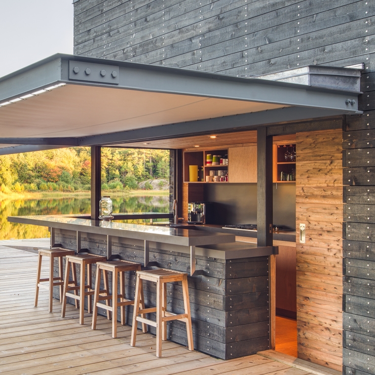
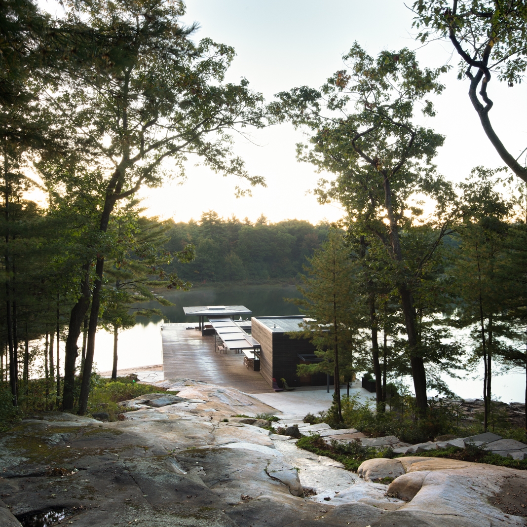
Weiss AU's boathouse was featured in the Spring 2015 edition of the magazine. Kevin Weiss' design deserves the kind of attention it's been getting lately and we hope to see more of his work published in the future.

Stay tuned for future publications of our images.


Little Trinity by DTAH

Earlier this summer, Revelateur was commissioned to shoot DTAH's little trinity project. This is constitutes a good example of adaptive reuse in the city of toronto. This was a fun shoot as it was all about showcasing the interplay between the old and the new. 

Facade on King St. East (at Parliament).

DTAH has a summary of their project here:

"The Little Trinity Church community, founded in 1844 near the corner of King Street East and Parliament Streets in Toronto, developed a building expansion study to investigate the renovation and redevelopment of the three buildings on their site to maximize community worship, social services, and recreational uses in response to the future West  Don Lands development immediately south of their property.

Back of building from garden.

DTAH redeveloped the derelict 19th century townhouses at 399 King Street into the Little Trinity Annex, a new administrative centre and multi-purpose hall for the church community. Renovations in the school house building included the basement multi-purpose hall and ground floor child care spaces to maximize Sunday School capacity and functionality."

Multi-purpose hall.

Although a small project, it was a fun shoot as adaptive reuse presents challenges that are not necessarily evident when shooting other kinds of projects.

Building from garden.

Stafford Development projects

We have been working with Stafford Developments to shoot some of their completed projects to showcase on their new upcoming website. Below are some shots that we did for them:

The Rushton Residences, 743 St. Clair W.

530 St. Clair W.

500 St. Clair W.

Film District Towns

Stay tuned for more cool shots to come...

Tips for hiring an architectural photographer #9

This is post 9 of a series of 10, in a series detailing important aspects to hiring an architectural photographer while avoiding the most common pitfalls.

9. CHOOSE EXCELLENT CUSTOMER SERVICE. 

Professionalism prevents a lot of headaches. It is often said that the first impression says a lot about a person. Make sure your photographer cares about your needs in more than just words. Their attitude, attentiveness and professionalism should show in everything they do. Make your life easier by choosing someone you can rely on. 

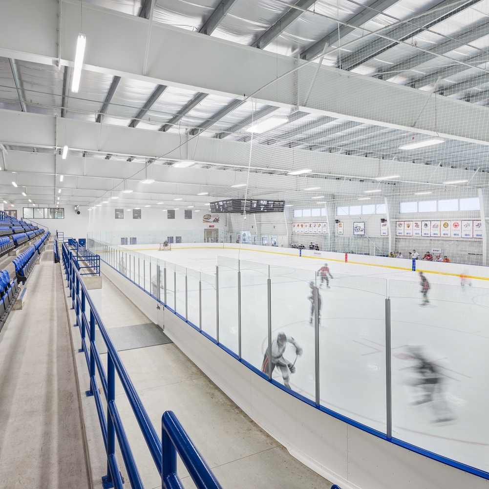
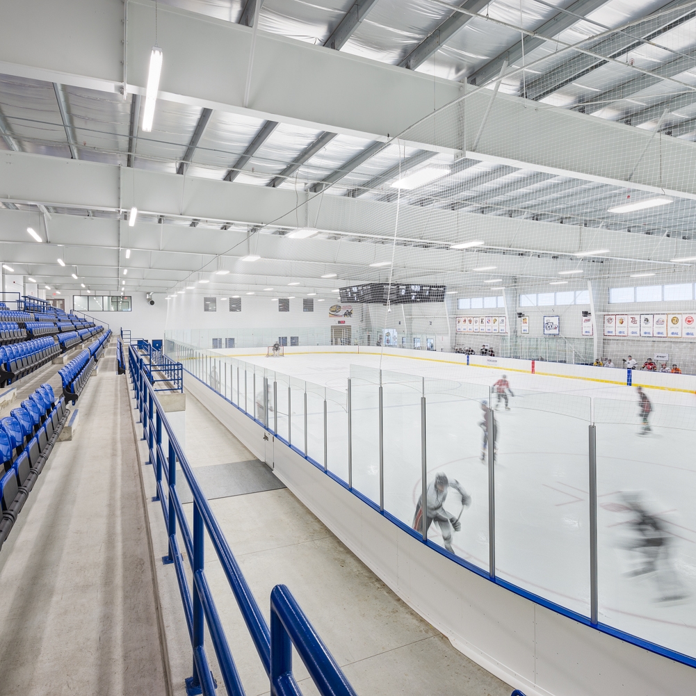
Buckingham Arena, WGD Architects, Toronto.

Buckingham Arena, WGD Architects, Toronto.

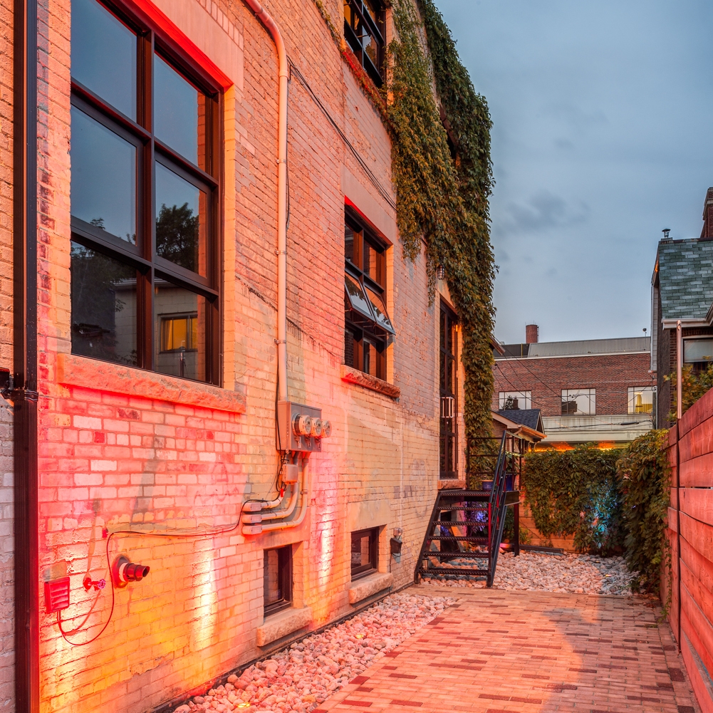
Little Portugal fixer-upper by Downey Design

This project was featured on our blog a few months back, when we shot the interiors for the Designer. We have recently returned to shoot the exterior of the building upon completion of the landscaping.

Main facade

Home to Arts & Labour home-studio, the renovation turned an old factory into an airy, bright space that appears to be much bigger than it actually is.

Main Entrance

Although the renovated building may appear mundane at first glance, it is the simplicity of the elegant materials and solid detailing that makes it come to life in an understated fashion. It is first and foremost a very livable space as evidenced by the spatial and light qualities one finds throughout the project.

Landscaped courtyard


Tips for hiring an architectural photographer #8

This is post 8 of a series of 10, in a series detailing important aspects to hiring an architectural photographer while avoiding the most common pitfalls.

8. CONSIDER ENVIRONMENTAL FACTORS.

Your photographer should know how to deal with these factors (seasons, weather and time of day) in order to take the best shots at the ideal time. Factor in weather and allow for contingency plans. Architectural photography is particularly subject to weather, especially when shooting exteriors. When planning a shoot, ask if your photographer has a contingency plan in the case of bad weather - and do not hesitate to reschedule. If images are shot in poor weather, you risk having to re-shoot the project at additional expense if the quality is negatively affected. Ask your photographer to supply you with a site prep checklist. There is a lot more going into preparing the site for photography than just cleaning up. In order to get the best looking shots, ask your photographer to make recommendations for staging the images. 

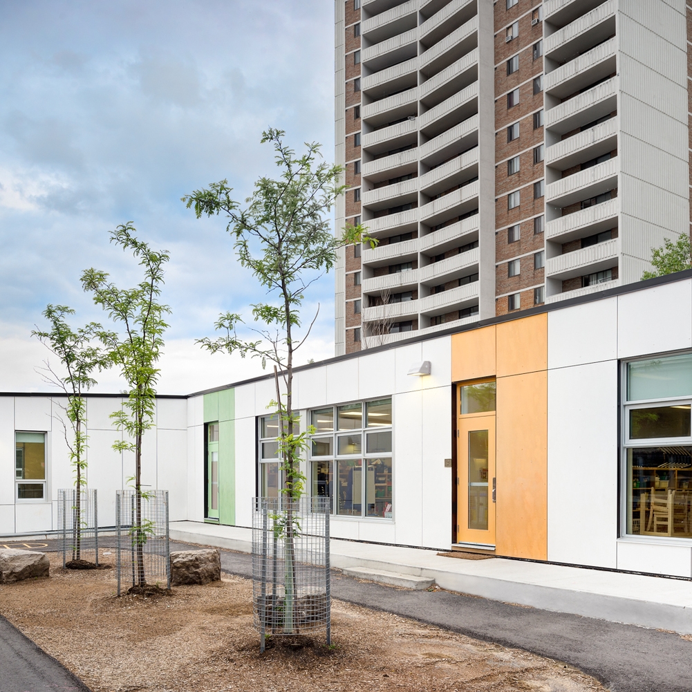
Warden Avenue Jr. PS, Kohn Shnier Architects, Toronto

Tips for hiring an architectural photographer #6

This is post 6 of a series of 10, in a series detailing important aspects to hiring an architectural photographer while avoiding the most common pitfalls.

6. MINIMIZE YOUR COSTS.

A good photographer will understand your needs and help you come up with a solution that fits your budget. There are many ways to keep costs reasonable and this should be discussed with your photographer, for example:

1. Shop locally if you can. By avoiding travel expenses, you save money and promote the local economy.

2. Bundle shoots together. If you can combine several projects to be shot at the same time, your photographer should be able to give you a better deal.

3. Use fewer and better views. Carefully consider the shots you need in order to save money. If unsure, your photographer will have a good idea of what shots will best tell the story of your project. Ask them to make recommendations.

4. Keep the bottom line in mind. How much money are you likely to make with these images? How many projects can they help you win? 

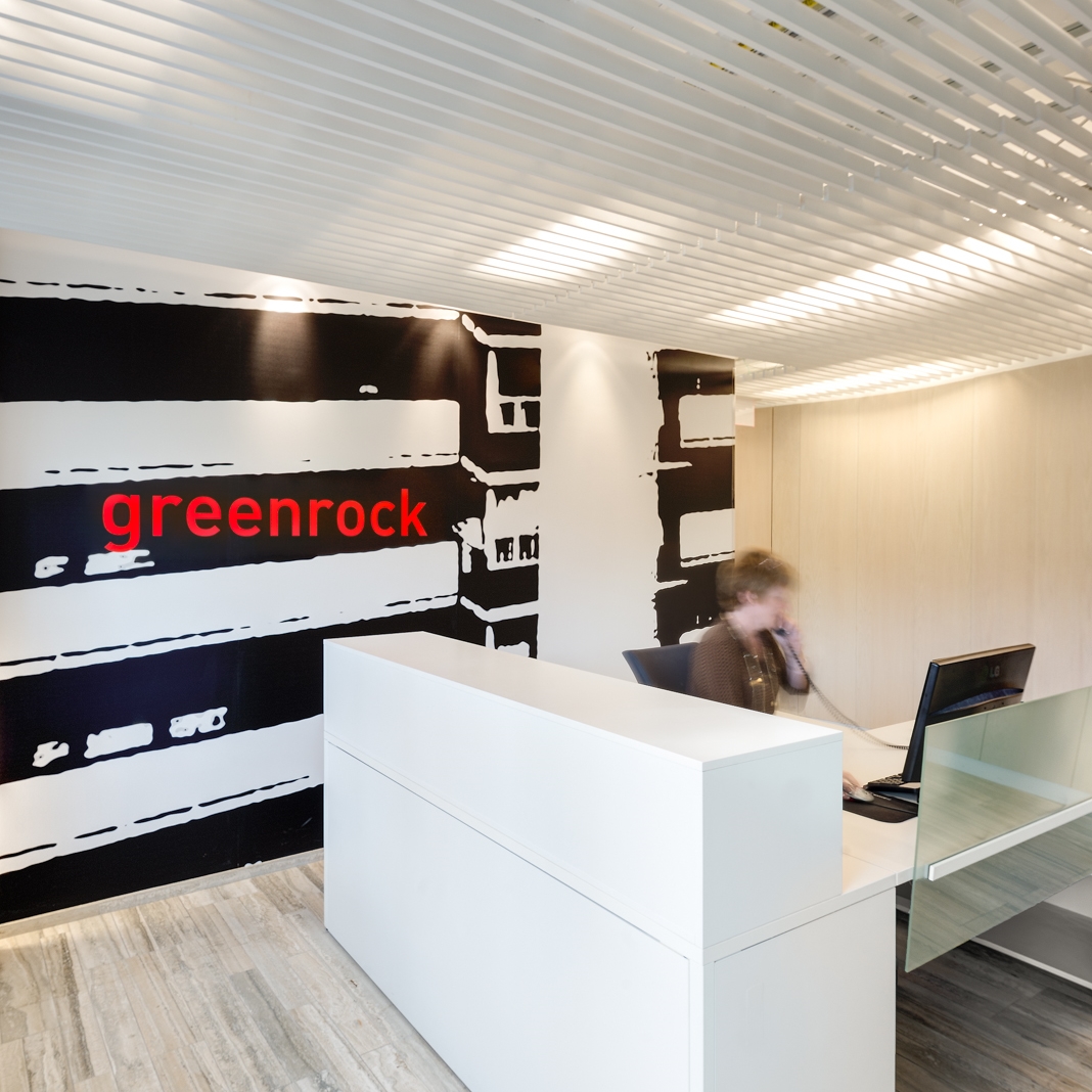
Greenrock rental management office, Toronto, Kohn Shnier Architects

Tips for hiring an architectural photographer #4

This is post 4 of a series of 10, in a series detailing important aspects to hiring an architectural photographer while avoiding the most common pitfalls.

COLLABORATE

Photographing buildings and interiors is not an exact science and it requires collaboration between the photographer and client, in order to achieve the client’s vision. Photographers have a particular way to look at spaces, usually different from the clients'. It is a good idea to use this difference in viewpoints as a sounding board for coming up with ideas that neither you, the client, nor the photographer might have thought of on their own. The pre-production meeting and the scouting shoot are great places to brainstorm and kick-start this process. If you are going to be present on the day of the shoot, use this to you advantage by discussing each view with your photographer and formulating your specific needs in the clearest way possible. Your photographer should be able to show you each shot prior to capturing the image to serve as the basis for discussion. 

Yorkville residence, Audax Architecture

Yorkville residence, Audax Architecture

Tips for hiring an architectural photographer - #3

This is post 3 of a series of 10, in a series detailing important aspects to hiring an architectural photographer while avoiding the most common pitfalls.

UNDERSTAND AND FORMULATE YOUR NEEDS. 

It is advisable to sit down and think about what your needs are prior to discussing them with a photographer, in order to make them clear to the professionals you will be hiring. Think about the aesthetic/mood you are trying to achieve, the number of images you need, the way you envision your project to be shot, your budget and any other specific requirements you may have. Photographers should be able to help you uncover these needs by asking a series of increasingly pointed questions and come up with a tailored estimate that will cover all those needs. Once that discovery process is complete, the photographer will know exactly what those needs are. Remember that “understandings prevent misunderstandings” and ask your photographer to clarify anything that is unclear. Do not let technical terms and jargon confuse you. 

Designholmen home and office by Downey Design

We had the pleasure to return to designholmen to complete our shoot.

Living room


In addition to the kitchen and dining room we shot the living room and the master bedroom. The understated elegance of the project, clearly influenced by designholmen's Swedish roots made the shoot a pleasure as there were many angles from which to capture the design, all of them looking really good. 

Master Bedroom


We hope you enjoy these images as much as we enjoyed shooting the space.